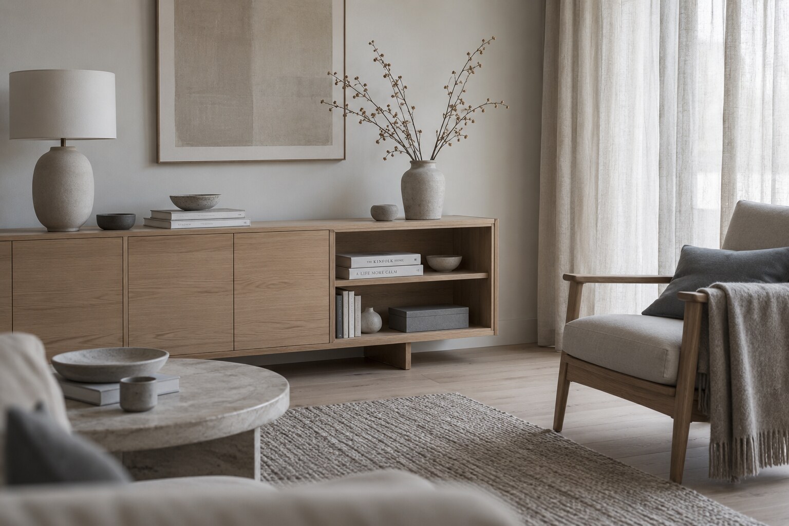
Nordic interiors often feel calm before they feel decorated. Their appeal is not only in pale walls or beautiful chairs, but in the way light, proportion, texture and restraint are allowed to shape the room.
Calm begins with light
Light is one of the strongest materials in a Nordic interior. Windows are kept open visually, artificial lighting stays soft and specific, and the room is allowed to change with the day. The effect is quiet, but deeply felt.
The palette does less
Neutral tones are often mistaken for emptiness, but their purpose is different. White, grey, sand, stone, soft brown and muted black create a background that lets texture, shadow and form become more visible.
Materials carry the warmth
Wood, linen, wool, ceramic, paper and stone keep minimal rooms from feeling cold. These materials bring evidence of touch, use and age, which gives the space a more human rhythm.
Nothing needs to shout
A calm interior does not compete for attention. Furniture has room around it. Objects are chosen with care. The eye can move slowly through the space without being pulled in too many directions at once.
Function creates ease
The most peaceful rooms often work well in ordinary life. Storage is considered, paths are clear, seating is comfortable and daily objects have a natural place to belong. Beauty becomes part of use.
A tonal edit shaped around warmth, texture and a calmer visual rhythm.