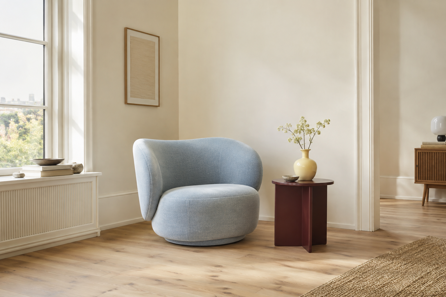
Picture a simple room: a comfortable chair, a small table, daylight and enough space to move. Now imagine the chair in powder blue and the table in burgundy. The room still has the same quiet structure. Only the conversation between its parts has changed. That is where colour becomes interesting within minimalism. A restrained room can have a distinctive palette, and Scandinavian design offers plenty of reasons to look beyond beige.
Why neutrals became the shorthand
White walls, pale timber and grey upholstery make simplicity easy to recognise in a photograph. Their close tonal relationships can let grain, texture and shadow carry more of the composition. But this familiar image is only one expression of Nordic design. Nordic describes a region with different countries, makers and traditions; minimalism describes an approach to reduction. They overlap, without being interchangeable. For this article, we are interested in that overlap: rooms where a few considered choices, including colour, can do a great deal.
What Copenhagen showed in 2026
Reporting from 3daysofdesign in June 2026, Australian Design Review highlighted burgundy and oxblood, richer browns and greens, and sky blue as a recurring counterpoint. These are observations from design presentations, rather than a survey of how everyone in Scandinavia lives. They nevertheless offer a timely starting point. A deeper colour can give a room a focal point; a paler one can keep the combination feeling open. Our reading is that there is room to explore this richness while keeping the number of competing elements small.
Colour already belongs to the history
Fritz Hansen’s Series 7 anniversary edition provides a useful reminder. To mark the centenary of Verner Panton’s birth in 2026, the Danish brand reintroduced four warm colours from the palette he created for Arne Jacobsen’s chair in the early 1970s: yellow, orange, red and brown. The form remains recognisable while the colour changes its presence. This is a return to an existing part of Danish design history. It challenges the idea that a colourful Scandinavian room must represent a departure from everything that came before.
Restraint can happen within the palette
Muuto’s current presentation of Sia Hurtigkarl’s Verso Rug offers a quieter example. Its two-colour weave creates variation through the way threads meet, with combinations including Cool Grey/Dark Brown and Pale Green/Warm Brown. Here, visual interest comes from a limited set of ingredients. In a room, a similar approach might mean repeating one shade in two different textures, allowing a large surface to remain calm, or giving one darker object enough space around it. The relationship between colours matters as much as the individual shade.
Three palettes to make your own
The following combinations are Nordic Way My Way editorial suggestions inspired by this wider conversation. They are not official brand palettes or paint matches. Use them as starting points, with colours and materials you already enjoy. Screen swatches are approximate; test physical samples in your room before choosing paint or upholstery.
01 / Powder blue, burgundy, chalk
Let chalk-white walls or a pale rug provide the largest area. Introduce powder blue through upholstery or a textile, then use burgundy for a smaller object such as a table, lamp or ceramic bowl. The pale blue gives the darker red something cool to sit beside. Repeating the burgundy once in a modest detail can make the combination feel connected without requiring matching furniture.
02 / Cream, butter yellow, warm grey
This is a gentle way to add colour to a room that already feels quiet. Keep cream as the background and let a soft yellow carry a little warmth through a chair, cushion or lampshade. Warm grey can provide definition through a rug or fabric. Look at the yellow beside your existing white surfaces: the same shade can feel soft in one setting and unexpectedly sharp in another.
03 / Oak, deep brown, soft white
Treat the timber you already have as part of the palette. Oak brings variation through grain, while deep brown can add weight in a chair, frame or woven textile. Soft white leaves space between them. The oak swatch below is only a tonal reference: real wood varies with species, finish and light. This combination works best when the different surfaces retain their own texture.
Try the colour before changing the room
Start by moving something you already own. A blue throw from the bedroom or a dark bowl from the kitchen can show you how a new note behaves. Look at it in daylight and with the evening lamps on. Consider how much space it occupies, what it sits beside and whether you still enjoy it after the first impression. A trend can prompt the experiment; your experience of the room should guide the decision.
A calm room can still have a point of view
Beige remains a useful and beautiful option. So do blue, yellow, red and brown. The most compelling palette is one that makes sense with the room’s light, materials and everyday use. You can keep the arrangement simple and allow colour to bring personality. Minimalism leaves space to notice those relationships: a cool fabric beside warm wood, a dark edge against a pale wall, one small object that makes the whole room feel more like yours. for those who notice.
Sources
On light, materials and the quiet discipline of visual restraint.